Selected Artists 2024
Tom Andries
|
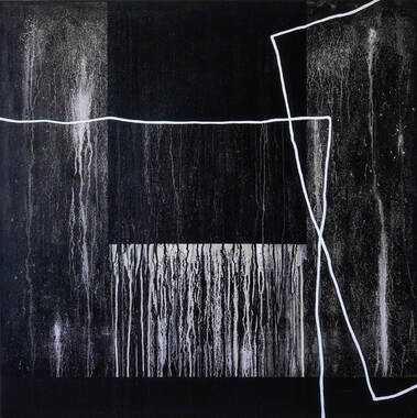
Tom Andries (°Leuven 1969) is a Belgian multidisciplinary designer and contemporary artist. His main body of work consists of monochromes painted in heavily textured black ink. Tom uncovers the essence and hidden beauty of typography, abstracting basic geometric forms from letters. He trained as a typographer and graphic designer.
Tom Andries’s artistic practice consists of creating a series of abstracts painted in black ink directly onto the canvas. With a few strokes of a heavy brush, he covers the surface from edge to edge, creating abstract forms derived from typography. Often working in black on white, he purposefully uses curve-linear and angular compositions to add tension. Tom has developed his own ink with a very specific viscosity – it is a mix of acrylic, Indian ink and charcoal – which gives every painting a surprising depth. Inspired by minimalism, modernist painting and mid-century architecture, his work reflects an ongoing quest for the absolute minimum. Tom’s canvases simultaneously convey an extraordinary calmness and a natural spontaneity. |

|
Kaatje Arickx
|
The two media Kaatje Arickx uses when creating her works are mainly charcoal on paper and oil on canvas.
In her charcoal drawings, she first sets out the rough lines with the charcoal sticks and then finishes them with her hands and fingers ... Thanks to the pressure used during this process and the choice made between smudging the charcoal or not, an effect is created which cannot be achieved with pastels or pencils. This way of working feels very earthy and primitive, comparable to the prehistoric cavemen who used their hands to apply coloured earth on their caves’ walls. On canvas, she usually uses oil paint. Because of its intense colour, fluidity and smell, Kaatje finds it a tremendously pleasant medium in which to work. She mostly creates character heads with it or fictional scenes onto which the viewer can project their own fantasies. This is why she doesn’t often give her works a title, even though she has one in her head. It would only push the viewer in one direction when it is much more interesting to hear what is going on in the viewer's head. For her, it is as if the viewer's subconscious is stirred up on seeing the work. |

|
Caroline Baek
|
Paint is a remarkably rich medium and her longstanding, close companion. Wherever she is, she observes and explores the nature of the world. In Mexico, a land of drought and innocent colours, soft pastel makes its mark, naturally expressing monolithic hues and powerful light. In the thick yellow mist of Laos, colours infuse for a long time before revealing themselves on shining silk. It is in this watery environment that she dipped her brush in the Mekong to mix it with flowing ink. Since then, her own story has become intertwined with her work. For over six centuries, her family has been seafarers. Naturally, she found herself unable to resist this pull and she set sail through the waters, using gouache to carve out the void.
Soon, her Flemish heritage led her to oil painting, despite the complete paradox of using oil to depict water. However, it is not about trying to become the next marine painter, but rather, about understanding the sea and translating her wisdom into lines and colours. |

|
Els Baekelandt
|
Els Baekelandt was born in Zottegem, Belgium in 1963.
From 1981 until 1985, she studied Applied Arts at The Luca School of Arts in Ghent, Belgium. From 1986 until 1999, she worked as a graphic designer and calligrapher in the studio of the famous French artist, Claude Mediavilla, in Paris, where she developed her extremely distinctive style, working on corporate logotypes, image advertising, headlines, titling for posters and books, and layout. From 1994 till 2014, she was in charge of the design and layout of art books, catalogues and the magazines Art & Métiers du Livre, Art de l'Enluminure and Métiers d'art, all published by Éditions Faton, Dijon-Paris. In 2007, she set up a workshop/gallery in La Charité-sur-Loire, Burgundy, France. From 2011 till 2013, she lived in Madrid. Since 2013, she has been living and working in Spain as well as in Ghent, Belgium. In her nature paintings, Els captures the beauty of plants, flowers, landscapes and still lifes in all their simplicity, with a quirky magical-realist touch. She uses various techniques including collage, watercolour and gouache. The works are subsequently given a layer of wax for protection. |

|
Sevan Bicakci
|
If anyone ever deserves the nickname of crazy, it's Sevan. Who else encourages himself to swim in the deepest, most dangerous and unknown seas? Who else would risk his career and his experience every time he designs a new collection?
Who else relies so intensely on the powers of his talented abilities? Sevan emphasizes that he does not design ornaments, but he does design unique and valuable jewellery collections. His current success can be attrributed to the hidden details, often derived from traditional craftsmanship, in goldsmithery, painting, sculpture and calligraphy. The underlying secret of his creativity is to be found in the country in which he lives. He is imbued with the richness of Istanbul's history, a composition of centuries-old civilization with feelings of mutual love and tolerance; it is an inexhaustible source of inspiration. Sevan Bicakci is making jewellery history! |

|
Petra Bonny
|
Petra Bonny is a designer and artist from Aalter. Her art schooling (in drawing and graphical techniques) was done at academies in Eeklo, Ostend and Ghent. She later specialised in surface pattern design.
"I love jazz. At live concerts, I greatly enjoy the way that the music, through interpretation, association and interplay, swirls around one central melody. My admiration for this is reflected in the way my collections and projects are created." |

|
Christ'l Bruynseels
|
After her studies in Regency Plastic Arts at the Heilig-Graf Institute in Turnhout, and later specialising in painting at the Antwerp Art
School, she ended up in the shoe fashion world. After more than 20 years of running her own business and raising children, she picked up the thread again. Travelling to Sicily with a camera borrowed from a friend, she fell under the spell of photography. She started photography in 2015 at the Institute of Decorative Arts and Crafts in Antwerp and successfully completed her studies there in 2017. After a specialist year in 2018, she enrolled at the Royal Academy of Fine Arts in Antwerp for a course of Photo-Art to refine her work, graduating in 2022. Inspired by nature and the world around us, her images are impressions of a world that passes by, exploring the border between photography and painting. In her images, there is an element of mystery which reflects her being. Every day, banal things inspire her to create picturesque, poetic scenes. She is fascinated by what she can’t see but which is gradually revealed through observation. Behind the everyday world lies another, unknown world and photography, visual art, is the best way to learn to know it. “I don’t go looking for reality; reality comes towards me and I make it my own.” |

|
Tiziana Buffagni
|
Tiziana is passionate about the human condition and the connection between body and soul, which she honours in her portraits and nudes. She captures, through form, the mystery of the soul; the energy and movement of life. In her artwork, she finds this movement in small gestures, to which she pays particular attention, like the way hands, feet, expressions, hair and draperies move. Beyond human models, nature is also a major source of inspiration, with its textures, shapes, and colours; she is intrigued by the way infinitely small cell structures mirror the infinitely large structure of the universe. Organic and geometric movements, the pulsation of life: she finds all of these in her subjects. What she is ultimately looking for is the spiritual link between all of these elements. She also captures the links between body and soul, between humans, nature and the universe, between small and large, between emptiness and fullness, between silence and sound. She reflects contrasts in the density of matter. She finds aesthetic harmony in balancing and playing with contrasts. Hers is a constant search for interaction with matter, be it clay or colour, which she touches - as well as letting herself be touched and guided by it. A conversation. A dance. This harmony, this balance, this spiritual link to Wholeness, is always present, even in chaos and in the resistance of material density. This is what she seeks to express, transmit and share through her artwork.
|

|
Bujdoso Balazs
|
The name is Bujdoso Baranyi, Balazs, that’s why he signs as BuBBa.
He was born in Hungary (30.07.1970). Although he always says he is self-taught, it isn’t completely true. For as long as he can remember, he has always loved to observe paintings. And whenever he sees a painting, he seeks out techniques, the use of colours, etc. So, perhaps it is better to say that he learned from many painters. He has an eternal love for the so-called “ideal landscape” genre that was popularised by Nicolas Poussin and Claude Lorrain and mastered by one of his countrymen, Karoly Marko sr. Apart from this evergreen genre, he always aims to depict everything in the most realistic way possible. Briefly, he would say he professes the old values of art, when its first goal was to delight by viewing. However, there is also something intensely personal displayed on his canvas every time. Recently, his brushes happened to approach the doorstep of a kind of hyperrealism and he felt that this might be the path he has always been looking for. He has always loved to draw. He painted some pictures as a child and as a teenager, but later on, this creative activity faded into an irregular hobby. Still, back in ’95, painting began to play a bigger role in his life and became a more regular hobby. He spent seven years with gouache but since 2002, he he has worked only in oils, regardless if it is an original or commissioned painting. Although he became acquainted with tattooing at the age of 19, for a long time he only did it as a kind of friendly favour. Until, in 2016, he began to settle down, opening his own tattoo studio in Germany. Quite busy with this business, painting was somewhat pushed into the background again. But then many people wrote letters asking him to put painting into focus, so he finally semi-retired from the industry, took up his brushes again and does tattoos only once or twice a week. For him, taking up his brushes professionally still feels as if it were a cherished hobby. |

|
Hildegard Cambré
|
She was born in 1968 and raised in Vorselaar, a village in the Belgian ‘Kempen’. Her artworks arises from inner emotion and gut feeling. A recurring theme is the circle of life: not always perfect, often bumpy and with interruptions, just like real life itself. Recognizable elements are added as something familiar to hold on to in a rapidly changing world.
Hildegard mostly works with acrylic and mixes her paint with different materials to create depth and structure. |

|
Patricia Canino
|
Through her photographic work, she operates across digital and film techniques and uses both photographic and non-photographic methods, working towards an increasingly plastic and poetic approach of the image. With "Locked inside", she oppened up the possibility of transforming the very body of the photographic emulsion with her hands. On a glass surface, the emulsion sculpts, wrinkles, deforms bodies locked up, stuck against a transparent window. What is actually being locked down? Probably ourselves. This invisible confinement is one which we bump against, stick to - and which the person in front of us has the possibility of seeing or pretending not to see. It is precisely this confinement from which we dream of escaping and from which we try to escape for an entire life.
|

|
Frank Carlguth
|
Frank Carlguth's paintings show visions of “people and nature” in the future. People who are originally in contact with the environment are left behind in their surroundings. The images show an “apocalyptic world” in every respect. The “New World” is not only referred to in prophecy in the context of the environment or technology. Social components also play a crucial role.
For instance, children lack childlike charm and ideological transfiguration. Children, who are synonymous with humanity, shape the environment. This is a world in which they are fully human and the influence of nature is made directly apparent. A world of fiction is becomes more and more tangible. These visionary oil paintings are about something that is connected to the environment right now as it breaks apart or changes. These paintings show a world to come. |

|
Rob Chevallier
|
Rob works with second-hand objects combined with photography. His photo objects and installations connect a seemingly carefree past with the present time. A world with problems such as the economic race, overconsumption and climate change. His artworks are both a plea for recycling and sustainability, and a critical look at today's society
Rob deliberately chooses recognisable objects to involve the visitor in the artwork. He combines the object with a seemingly nostalgic past with current photography. In this way, he makes our changing society visible, portraying issues such as climate change, industrialisation and the need for nature conservation. In his installations, such as “De Stikstofboom”, “Energy Folly”, “The Key to our Future Existence”, “Hot Holland top 20”and “Nederland (bedreigd) Waterland”, he invites the visitor to play an active role in viewing or reacting to the artwork. |

|
Guy Cleuren
|
As an architect-artist, Guy Cleuren has been working on architecture as a renewed art form for decades. Architecture, for him, is an art medium to discourage rational thinking in both architecture and life. This work belongs to his 'Autobiographical Architecture'. This work shows settings of desired perceptions; experiences of usually banal living components. Those living components can be: bath, gazebo, bed, ... This work shows nine different arbours that differ greatly from traditional arbours. It aims to show that optimal architectural experiences (mini architectural experiences in the foreground to enhance views of the landscape)go beyond the elements we usually use and are offered. This is architectural criticism through architecture.
|

|
Anne Collard
|
Anne grew up in the 60s, when Pop Art was exploding and taking over the world. The American influence, the colourful adverts, the cinema posters, the comic strip characters: all of these were her daily life. These colours and messages left their mark on Anne, and naturally her work became a reflection of that era.
The Plexiglas boxes add perspective and depth, allowing you to see things from a distance. Each work is a unique, hand-painted piece, sometimes combined with a collage to mix the materials. |

|
Peggy Coussement
|
Peggy Coussement : "Emotions, experiences, feelings, impressions, state of mind, concerns, or even 'the void' ... These are things you can find in someone's facial expression or in someone's 'being'. Sometimes very subtle, sometimes very present...."
Consciously and unconsciously she goes into search mode. A continuous exploration that she expresses in form, composition, material and colour. Either in clay, bronze or Neolith. Colour is largely connected and inherent to the manifestation of the sculpture. Her artistic expression stems from the desire to understand, analyse and create from the rich diversity of human input. Her creative process is an ongoing dialogue with the world around her, using her ability to learn and evolve. Sometimes the impulses come from her deepest emotions and she tries to create this inner world in a tangible form. |

|
Catherine De Keukelaere
|
Catherine De Keukelaere comes from Deinze and studied at the St.-Lucas Institute in Ghent where she developed her love for portrait and form. For a long time, drawing and painting portraits were her way of capturing gaze and emotion. Later, she switched to working with clay, zellaan, acrylic one when creating sculptures, where expression/feelings or movement/stature, are central. Haut-relief is definitely one of her preferred art expressions, here she is inspired by her great-uncle. The reliefs with the elegantly styled heads of ostriches are an example.
|

|
Claudie de Vlieger
|
In her countless visits as a KLM Purser to vibrant cities like Bangkok, New Delhi, Mexico City, Nairobi and more, Claudie found herself captivated by the kaleidoscope of colours, patterns and combinations as well as the enchanting interiors of Asian, African and South American cultures.
She couldn’t resist filling her suitcase with an assortment of colourful fabrics, paper bags and even local newspapers. Claudie eagerly collected these treasures during her explorations of local markets and quaint shops. To Claudie, a canvas is a challenge like a living space; it has to be filled up with mixed media. She is constantly striving to find harmony between the old and the new; the colours, and the boldness and softness of materials. It’s a delightful dance of black and white, as well as vivid and subtle hues in figurative forms. Drawing inspiration from her mother, who was an accomplished artist herself —a painter, ceramist, and florist — Claudie was fortunate to inherit her creative spirit and to explore various artistic media. Her artistic journey began at the St Lucas Art Academy in Kapellen, Belgium, where she spent nine years honing her skills in acrylic painting, drawing, and art history. Later, Claudie proudly opened her own gallery in Antwerp, aptly named Room for Art, which allowed her to showcase her work and connect with fellow art enthusiasts. |

|
Nicolette de Waart
|
Sculptor and designer Nicolette de Waart's work is shaped around the themes of Connection, Femininity and Beauty. She has built a cohesive body of works across multiple disciplines and materials with a vocabulary deeply rooted in nature and her fascination and curiosity with the different cultures and countries she lived in. 'FORCE OF THE SPHERES' visualises emotions gathered during our lives. Nicolette takes a bold and heartening approach to the conventional wisdom that all people are shaped by their life experiences.
This artwork attempts to reflect a person's life by uncovering our vulnerability, fragility, strength, and passion. Usually, these emotions and memories are invisible, but sculptor Nicolette de Waart has laid them bare in this work. These organic spheres resemble memory foam, as if it were a protective cushion to help us cope, giving us resilience and wisdom for the future. |

|
Ann Dejonckheere
|
Ann Dejonckheere is a versatile artist. Over the years, she practised several disciplines with different materials. In the past, she applied charcoal techniques in beautifully crafting her landscapes. Her series 'Beyond observation' was a balance between the figurative and the abstract. But recently, colour has entered her work which has now evolved into lyrical abstraction.
Using pure pigments, charcoal and Chinese ink, she creates her own original drawings. They are her own designs, very thoughtfully created while drawing herself. With her fingers and hands, she rubs on large-format paper. Through intensity and tonality, she manages to create space and depth in order to give a three-dimensional impression. She has her own unique style. Her latest series, 'a feeling of fire', shows movement and dynamism. She invites the viewer to fantasise and enter her pictorial world. The experience can last a long time because her visual language is endlessly varied and captivating |

|
Véronique Deschepper
|
As a Belgian painter born on 09/04/1965 in Charleroi, Véronique explored various artistic techniques from an early age. It was at the Charleroi Fine Arts Academy, where she studied the importance of pigments in restoring works of art, that she really developed her mastery of colour and oil painting, favouring this technique for its distinctive texture.
Her artistic approach is resolutely minimalist, sometimes punctuated by the use of clouds to infuse an ethereal touch, sometimes soft, sometimes vaporous, sometimes transparent, sometimes mystical. Helped and influenced by her travels in the Far North and Africa, the horizon, a recurring element in her creations, opens the door to her imagination, creating a reassuring sense of stability. Whether sharply defined, delicately suggested or blurred, this horizon embodies the genesis of her work, underlining the singular artistic identity that characterises her works. Véronique's current work is evolving towards a world situated between abstraction and representation, while exploring the concepts of space and time. The main foundation of her creations is COLOUR. Her creations are characterised by their harmonious gradations and fades. Using a meticulously artistic approach, she deliberately erases all traces of the brush, also dematerialising the work by using little material, which gives the whole an impression of fluidity. This approach invites the viewer to let themselves be surprised, to dream and to plunge into their own inner world. Véronique's canvases are an invitation to deep introspection, a symbolic sharing that goes beyond a simple glance. The gradations become a hymn to escapism of the spirit, provoking a feeling of letting go. In short, her aim is to evoke deep emotions and establish an intimate connection between the viewer and the world of her canvases. |

|
Jo Dierick
|
With her work, Jo wants to show the metamorphosis of a blind person's diagnosis based on the skin of ceramic dogs.
She has 11 ceramic dogs, each unique and with a different structure, skin and clay. Each dog tells a phase in the processing of a blind person. The first dog reflects the diagnosis ‘going blind’ This is a black dog and represents the black hole ; the knock of the hammer when the world stands still for a moment. With the second dog, Jo wants to show that his world falls apart into bits and pieces for a moment. The following dogs show the sadness, the prison he is in as a blind person, the anger, the acceptance, the bright spot at the thought of a guide dog and then finally the moment of acquiring a guide dog. This gives him more freedom and independence - diminishing the depression - and more contact. The dogs are all handmade, unique and may be touched because the blind and visually impaired also want to experience art. |

|
Nathalie Duflos
|
Utterly exhausted and feeling like a complete failure, Nathalie Duflos left her corporate job in 2019, not knowing what the future would bring.
Instead of despair and emptiness it brought healing, deep connections and a life of fulfilment – a much better life than she had ever imagined. A big part of this was due to her reconnecting with her creativity, a side of her identity that she had ignored for decades. Since then, she is determined to make up for lost time by soaking up every bit of inspiration, light and colour that comes her way. This has resulted in paintings based on deep feelings, the vulnerability of human connections and the absolute certainty that we are never broken |

|
Bram Eliart
|
At the age of 18, Beliaert began a soul-searching journey, exploring life. Until the age of 22 he travelled between the spiritual landscapes of India and the grounded reality of Belgium. Guided by a fascination for the ancient crafts and art he witnessed, Bram Eliaert sought and found mentorship with Walter De Buck in his hometown, Ghent. For seven transformative years, he served as an apprentice sculptor until he felt ready to embark on his solo artistic journey. Beliaert’s art explores equilibrium-phisically, with figures on high pedestals, and metaphorically, the dance between humanity and nature. Each sculpture is a silent poem, a frozen moment in time, a meditation on the interplay between creator and creation, inviting reflection on life’s delicate balance.
|

|
Rita Figus
|
Born in Luxembourg and of Sardinian descent, Rita Figus ventured into the art world in 2005. As a professional therapist, she melds her skills with her passion for painting, infusing her creations with psychological and emotional depth. Guided by her emotions and intuition, Rita creates vibrant works where abstraction subtly merges with poetry.
She transforms her canvases into reflective spaces, using her art to bridge the visible and the invisible, as well as the conscious and the subconscious. In addition to painting, Rita also practises lyrical singing and various relaxation techniques; activities that enrich her expressive and creative skills. The interaction among the various elements of her activities — singing, relaxation, and painting — enriches the creation of her works, thereby offering a more immersive and contemplative artistic experience. |

|
Laurent Forton
|
From an early age, Laurent (°1961 living in De Haan, Belgium) developed a keen interest in technology, creativity and entrepreneurship.
After obtaining his engineering degree, he ventured into business with a synthetics processing company where technology and innovation are guiding principles, a daring initiative at the time. Travelling far and wide in the quest of finding high-quality techniques is one of Laurent's passions: experiencing is knowledge, knowledge can be harnessed to develop skills, and meanwhile every contact strengthens our connections. Furthermore, Laurent dares to collaborate without compromising his authenticity. Designer, fabricator, assembler ... Laurent is driven by one thing: innovation. Therefore, self-study, experimenting and the manufacturing of sometimes far-fetched ideas is not new to him. Increasingly, the need to be creative manifests itself within Laurent. This drive is clearly demonstrated in his latest paintings, installations and objects. Laurent has also been working on the harmony between art and craftsmanship over the past few years through Projects with a big P. Each project is a unique reflection of a goal, with a specific emotional aura or social message in which humour often lurks in the background. They regularly emphasize women's right to existence in a simple but powerful way. His oeuvre comes across as rather eclectic, always innovative and often unpredictable. His AtelierForton is located near Bruges (Lissewege) in Belgium. |

|
Fabian Freese
|
Fabian Freese spent a large part of his childhood in nature, playing with wood and water, which influenced his sense of beauty and aesthetics. When he was a teenager he developed some experience by doing Graffiti.
Today Fabian Freese's work is a exploration of the urban environment. He is searching for materials which are used in the life of nearly everybody in our modern times and then he transforms them into his artworks where the original idea of the use of the item is no longer important, just the form and colour of it matters - like in the Everyday Objects Series. Another series which is based on the life in contemporary cities around the world, is the lightpainting series. These are time exposure photographs in which Freese interacts with and reflects the space of the urban environment where the photo is taken, while the exposure goes on. It usually takes about 1 - 3 minutes to finish these light compositions. Freese often combines different fields of contemporary art, like painting with photography or painting with objects, etc. He tries to transcend the borders of traditional art ideas to create his works which are often very forward thinking. Freese studied visual Arts at the Freie Akademie der bildenden Künste (fadbk) in Essen, Germany, and graduated in 2011. Since 2011, his artworks have been exhibited in countries across Europe, America, Asia and Australia. |

|
Gaka Mira
|
Gaka Mira (°1970) grew up near Bruges in Belgium. As a child, he had a passion for drawing and painting on the large sheets of paper he found in his father's print shop. The art books that rolled off the press were his inspiration. While he had a career as a psychotherapist, music teacher, coach and expedition leader in Polar regions and mountains, he never stopped studying and creating art. Meanwhile, he developed his unique artistic voice. In 2022, he decided to dedicate his professional life entirely to his passion for art.
Gaka Mira unites the abstract and the figurative in amazing, almost 3-dimensional sculptures created with acrylic, pure pigments and epoxy. Innovative and creative, working with media from industrial applications, he gives surprising results. He reframes reality through the persona he captures as a street photographer with a 50-year-old point-and-shoot camera into an abstract universe. The glossy quality of his work functions as a mirror in which the viewer sees himself. |

|
Nina Gerritsen
|
Nina Gerritsen is an artist born and raised in a picturesque village in the middle of the Netherlands. Growing up surrounded by fields and nature. Nina pursued various studies in the creative sector, eventually finding her true calling at the art academy, where she specialized in fashion design. In her artistic evolution, Nina's background in fashion remains evident in her current work. With a passion for experimentation, she seamlessly incorporates elements of fabric, paint, and patterns in innovative ways, breathing new life into traditional mediums.
Nina's art journey begins with intuitive forms, crafting cotton patterns hand-painted with vibrant pigments. These become stitched collages, each a fusion of color and composition. Inspired, she wakes up with "Stitching Landscapes," starting her fabric journey. With diverse themes, Nina breathes life into landscapes, weaving stories into her textile art. This profound connection with nature became a central theme in her art, reflecting her belief that we are all connected to a bigger source. With every creation, she continues to paint a canvas of beauty, passion, and joy, inviting us all to join her on a journey of artistic discovery and self-expression. |

|
Anja Gielen
|
Anja's adventure began in the fascinating world of fashion and fine arts, where fabric and form come together. There she discovered the power of textures and how they can tell stories without words.
From fashion, she moved on to painting. Anja's brush became her guide and she let her emotions run wild on the canvas. And then there was that deepening of spirit ressulting from art and religious studies, through which she uncovered the deeper layers of meaning in art. In her paintings, you will find no rules, only the freedom of creativity. As a result, each work becomes a journey through thoughts and feelings beyond the visible. For Anja, art is a universal language, breaking the boundaries of disciplines and bringing people together. Currently, she is still exploring and mixing fashion and painting in her creations. All this inspired by the constant dance of life. |

|
Raphael Ghindt
|
Raphael Ghindt became a professional artist at the age of 19 years. Today he is established in the international Street art scene. He has had workshops and mural commission works in and outside of Europe. His best known style of artworks consists of portraits which are between abstract and figurative. He treats the colors with an expressionist manner, working a lot with spray paint, acrylic paint, and a pallet knife. He shows emotions as well as impulses and touches his public with very soulful paintings. The people in his paintings are often members of an affecting personal life period or important personas of the space/location in which he creates the artworks. With his business partner Daniel Mac Lloyd, they created murals in Turkey, Portugal, Italy, and many other countries.
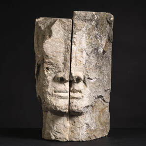
In his recent results, the theme remains quite close to his older works but focusing more on the idea of the division of emotions of the face that he creates. His expressive portraits are now often divided into two side-by-side glass plates. The two parts still form a whole face, but each one represents an individual expression. This is further visualized by a separation between the two plates. Placing the works in bases, the object takes on a more monumental side, almost like a totem. |

|
Griet Goeminne
|
Griet Goeminne is a passionate Belgian artist who puts her heart and soul into every work she creates. Her artworks arise from silence, without having a particular concept in mind beforehand. She is inspired by meditation, letting her feelings
speak while painting. She does this while dancing, singing and sometimes drumming. Movement is central, based on the conviction that everything is in motion. This spontaneous approach results in works that reflect her inner experience and (female) energy, while appealing to the viewer's imagination. With her work, Griet wants to inspire others to create their own story. For Griet, it is important as a woman to have her voice heard in the world. This theme therefore plays a major role in her work. Her creations are expressive, colourful and have deep meaning. From a young age, Griet has had a huge passion for painting. After studying nursing and a subsequent journey of discovery around the world, as well as a practice for energetic healing, she picked up the thread in 2018. She works mainly with acrylic paint, pigments and oil paint, occasionally enriched with natural elements such as dried flowers and leaves or grass |

|
Cosimo Gottschall
|
Cosimo Gottschall's expressive aquarelle paintings and Raku glazed ceramic sculptures reflect a profound connection with nature, capturing a vibrant essence through a fusion of color, form, and texture. His time spent in the rugged landscapes of Morocco and the serene forests in Japan has imbued his work with a unique vitality, creating a harmonious blend of external reality and inner vision. Gottschall's art invites viewers to explore the depths of his inspiration, questioning the relationship between human and the natural, and revealing the profound ties that make us one.
|

|
Therese Groeneweg
|
Therese Groeneweg, born in the Netherlands and now living in France, is a needlefelt artist (making wool paintings).
A few years ago, she moved from the Netherlands to France, to a beautiful area in Pays d’Auge, south of Normandy. The nature there inspires her to make her wool paintings. A long time ago, she discovered the making of art paintings, and changed that to needle felting and fibre art. And that is what she nowadays does, with a lot of passion. Mainly she makes ‘mystic art’ and one of the most important feelings to her art is the making of the eye or an underlaying meaning of the scene, the soul of her art. Her wool paintings are guided by the wool and therefore each painting is unique in texture. She makes her art under the name Needlefelt Addict. |

|
Caroline Hanny
|
Caroline Hanny's work questions contemporary animism. With the
the spread of cities and industry, part of the population has cut itself off from its senses, disconnecting itself from a life in symbiosis with nature. The artist takes on the role of shaman, staging herself in performances and videos. She appears and disappears behind veils that flutter in the wind, honouring the passage to the beyond. Her dance-trances evoke offerings to the spirits. She creates her costumes like ceremonial garments, which she deconstructs during the rituals to recreate another garment live. The recurrent transformation in her work emphasises both a process of sacralisation and the permanent evolution of vibratory frequencies. Fabric is a powerful element whose metaphysical and symbolic dimensions make it an object of worship for communicating with spirits and marking their presence. Her photographs transfigure nature by playing with blur and depth of field. Silhouettes become ghostly, and animals assert their magnetic presence. Metamorphosis intrudes on the creative process, reminiscent of the mischievous spirits who change appearance in certain tales and legends. The artist also uses various media as rites of passage to arrive at a final work. She composes mystical altars to invoke supernatural entities, using elements cut from fashion magazines. The ensemble is photographed to establish contact. To celebrate and crystallize the exchange, she paints over the images, creating abstract totemic forms, receptacles for spirits. Could animism be a way of sublimating reality? |

|
Jolien Janie Henriet
|
With her designs, Jolien wants to make the world a happier place. She is often inspired by nature and its colour pallet; she often seeks the spiritual through meditation in order to create visual images.
She has a fascination with people's behaviour, their faces, characteristics and emotions, which she then tries to put on canvas in her own colourful, imaginative way. Painting is above all an expression of emotion and the processing of feelings and thoughts. Letting your inner child play once in a while - that helps you to connect with everything that has gone on before in life. |

|
Thierry Hensgen
|
After working for thirty years in various service trades, Thierry Hensgen decided to make a living from his passion for art and sculpture. Following various training courses in this field, he had been practising these activities in his spare time for over twenty years.
Today, he uses his know-how and artistic creativity to offer you original and astonishing creations that let the light through and attract your hands as well as your eyes. These are designed, conceived and crafted by Thierry from what he considers to be the noblest and most durable of materials: wood. And it's by using the characteristics of this extraordinary medium that he is able to create works that couldn't be made with any other material. He mainly works with local species from sustainably managed forests. But he also likes to work with recycled wood as part of a more short circuit approach. |

|
Philippe Henssens
|
Originally from Belgium, Philippe Henssens is a contemporary artist who focuses on geometric art and exploits many techniques. He is constantly in search of a harmonious visual effect in his compositions of shapes and lines. His creations are imaginative, constructive and inspired by architecture and urbanisation. His creations give free rein to your thoughts and plunge you into questioning. He likes to say that we don’t all have the same reading of the work, but the main thing is to like the story.
|

|
Martha Hugo-Mill
|
The freelance artist Martha Hugo-Mill works exclusively in series. Figurative and abstract painting are equally important in her work. Femininity is a central theme in her figurative work. The viewer is presented with an intense view of the complexity of emotions, but one which leaves room for personal interpretation. The discourse in her graphic-abstract work, on the other hand, juxtaposes forms and colour surfaces that are composed with the utmost precision.
One of 35 artists, she was invited to exhibit at the Festival of Lights Berlin in 2022 with the installation "Urban Nature". At this event, important Berlin landmarks such as the "Brandenburger Tor", "Berlin Fernsehturm" and "Schloss Bellevue" are staged every year. In a current group exhibition at the Holger John Gallery in Dresden, she is represented with an old-masterly large-format oil painting based on a photograph by the artist Jürgen Teller of the fashion icon Dame Vivienne Westwood and her husband Andreas Kronthaler, as well as two free figurative works. Artists such as Marina Abramovic, Jiyun Cheon, Katharina Arndt, Hanne Darboven, Jenny Holzer, Cornela Schleime and Miriam Vlaming are presented in the exhibition "Madonnen & Medusen". Martha Hugo-Mill began her artistic career by studying fashion design in Berlin. In the following years, she expanded her skills as a graphic designer in a renowned advertising agency. She was able to deepen her painting and graphic design skills by studying at the Dresden University of Fine Arts, where she graduated with a diploma in theatre painting (the most famous representative of which is the international artist Gerhardt Richter). Before she decided to work as a freelance artist, she worked for a long time for theatres, film projects, museums and independent restorers. |

|
Karen Ketels
|
Karen Ketels is a Belgian professional photographer, based in the Flemish Ardennes. She is intrigued by nature’s beauty, by movements, macro-details, soft colours, whites, silence, minimalistic scenes ...
With her work she wants to make the unseen visible, to evoke silence, and create minimalistic images with an extra touch of beauty. |

|
Caroline Knockaert
|
Artist Caroline Knockaert started drawing at an early age. She grew up in a family of artists where both mother and grandfather were highly skilled in different art disciplines and methodologies. So Caroline started studying at the Art Academy where she specialised mainly in oil painting. Here, she uses preparatory material and works mainly by image. The themes she deals with are largely intuitive, emotional and related to life experiences in the various stages of her life.
Her works can be recognised by their bright, warm colour combinations with black lines and contemporary suggestive expressionism. After many years of painting in oils, the artist Caroline Knockaert is changing course. She exchanges her safe canvases for experimenting with multimedia materials. She has left her studio and has started documenting daily scenes in her nearby environment. The drawings show the moment itself, tinged by her artist's gaze and embraced with humour. The snapshot calls for a fleeting medium which she quickly supplements with different kinds of playful lines and areas that result in colourful, cheerful marker drawings. As the markers are used, the colour runs or fades. Even the old markers with almost no ink left in them give her works beautifully surprising results, always creating exciting new effects. “I've always had a thing for lines, the black marker actually used for advertising! I thought that I would give this one a try, as I do like novelties and challenges. The direct strokes, visible and full of colour, enable me to draw quickly and directly onto paper, indoors and outdoors, on the train, in the waiting room or waiting for the bus. The boldness of the direct stroke |

|
Olivier Lamboray
|
Belgian surrealist painter Olivier Lamboray was born in Brussels in 1968. Internationally renowned and the winner of several awards, he has exhibited all over the world. He currently lives in Germany, after having spent twenty years in Indonesia. Nourished by this place, his paintings bring Belgian surrealism back to life in his own way: blue, dreamy, poetic, positive, symbolic and intoxicating. Often compared to Magritte and Delvaux, his work reflects the same themes: inspiration, love and the celebration of the beauty of our country and its architecture.
With a classical education, he studied mathematics at the U.L.B. and then moved into advertising design, which he soon abandoned because he was bothered by the commercial aspect of the profession. He began painting in 1992 and made it his raison d'être. Far from being in vain, his scientific studies have given him a rigorous, calculated and precise approach. In his work, we find a meticulous rendering of detail, the perfection of light and shadow so dear to the great Belgian surrealists, an allegory of mystery and atmosphere, a journey that takes us into a world where dreams enchant and the heart blossoms. "Painting is my journey" is a perfect way to describe him. Surrealism is at the heart of Belgian culture, and from an early age he was fascinated by the magical feeling of the surrealist dream. In his work, we find elements that are dear to our country: trams, stations, the shiny cobblestones of Brussels, art nouveau, Horta façades: all elements that highlight our cultural and architectural heritage. More recently, he exhibited at the Venice Art Biennale (2022), invited to do so by the European Cultural Centre, and a retrospective of his work is currently on show at the Musée d'Art de Tours in France, in the prestigious Hôtel Goüin, with over 60 paintings. |

|
Jean-Pierre Letienne
|
Jean-Pierre Letienne has been working for about 30 years on everything related to his two passions which are tattooing and art.
His media are very broad ranging from collages, acrylics, watercolour, pastels, coffee and much more. About five years ago, he decided to exchange his permanent residence for a travelling existence. He went completely off-grid. Not an obvious choice but a very conscious and considered one! A leap to freedom, away from his comfort zone. A leap into the unknown that required him to do everything by himself and often alone, to be creative, but, above all, to grow into a different form of consciousness. In this way, he largely detached himself from the 'rules society' and thus acquired his own freedom. This is a necessity for him to be able to do what he wants: make art with a neutral view on people and society. Art born from an ever-active brain, fed by his daily experiences and responsibilities. |

|
Dinah Letteboer
|
In daily life, Dinah is responsible for large city area developments as a programme manager. Her passion for art and architecture began during her studies in Art History and has always stayed with her. In addition to her work, she follows master classes in oil painting, based on the painting techniques of the old masters. She often spends her free time in art museums for extra inspiration. The idea of sharing her love of colours led to the creation of DNH Artful Living, the company she started with her partner Edo, in 2021.
For as long as she can remember, colours have played a central role in Dinah's life. Colours allow her to express her emotions. That makes her approach personal, pure and spontaneous. The way she works with colours is highly dependent on a first reaction to a certain colour or combinations of colours. The only criterion she uses is whether a certain colour makes her heart beat faster and which emotions are strengthened by it. |

|
Ralf List
|
Under the creative direction of renowned artist Ralf List, colorful canvases in the style of Jackson Pollock are created that captivate with their uniqueness and richness of detail. BrandArt integrates original products from icons of the fashion world such as Louis Vuitton, Chanel, Gucci, Prada and many others into its works, thus blurring the boundaries between art and luxury.
Each painting in the BrandArt series is more than just a picture - it is a sculpture. By incorporating real luxury icons, each artwork becomes a three-dimensional experience that takes the viewer on a journey through the world of high-end design and contemporary art. Ralf List, whose artistic talent and visionary approach are internationally recognized, explains: "BrandArt is a tribute to the iconic brands that shape and define our culture. By merging these elements with the free and dynamic aesthetic of the Pollock style, a new dimension of art is created that combines the best of both worlds." |

|
Anthony Litjes
|
In this installation, Anthony explores and investigates the fascinating world of magnetism, electricity and the heart - three elements that permeate our daily lives, often without us realising it.
Magnetism: An invisible force that shapes our world, from the compass needle that guides us to the elusive attraction between people. It symbolises the hidden forces that connect us, even at a distance. Magnetism is also the basis by which we generate electricity and is also essentially the basis of our existence. Electricity: The energy that powers our modern world, bringing light to darkness and creating movement out of stasis. It represents the dynamic and often invisible currents that surround us and enable us to communicate and create. The source of life energy, the connector or signal between the brain and the body. Heart: The beating centre of our existence, source of life and emotion. The heart symbolises both the biological and emotional energy that makes us human, the rhythmic pulse that connects us to ourselves and others. By bringing these three forces together in one artwork, the installation invites the viewer to reflect on the underlying connections in our lives. It is an invitation to reflect on the invisible but palpable energies that connect us and keep us moving. Forces that are invisible but essential to existence. |

|
Daniel Mac Lloyd
|
Self-taught street artist Daniel Mac Lloyd’s (°1995, Luxembourg) artistic career started with his first exhibition in 2009 showing synergies of abstraction, pop art collage, and graffiti elements. Influenced by Graffiti, and graphic design, and inspired by the magic of details found in the streets, his style found its way to the kind of urban contemporary art that it is right now. A symbiosis of Graffiti, watercolour, and abstract forms, often in combination with bird or sea creature motives in all dimensions. Not only did Daniel win the Street Art Award Benelux 2018 for the best newcomer, but together with Raphael Gindt, he also created his own Urban Art Gallery and creative space in Esch-sur-Alzette.
Recently Daniel Mac Lloyd has focused a lot on experimenting with new materials and the deconstruction/manipulation of these materials. The breakdown of shapes and colours in his previous works also begins to become more visible in the physical substance of the works. After playing with the idea of a wooden collage last year, this year he started working on plasterboard, and cardboard, which he manipulates. This seems to be a route that he can develop even further in the future and find new ways to materialise his visual deconstruction. |

|
Armelle Maguer
|
Armelle Maguer is a French woman living in northern Germany. She likes to work on square canvases measuring one and a half metres on each side, with shapes that sometimes protrude from the canvas, and she uses natural, organic materials more and more.
|

|
Alexander Martijn
|
Alexander’s paintings are an explosion of colours, personifying the triumph he has achieved in his battle against depression and suicidal thoughts. Colours have nourished his soul, guided him
out of a dark and unpromising world. Alexander has been painting since his childhood and picked it up seriously again in 2018. Through his paintings he aims to bring a smile to the faces of everybody who admires them. Transmitting a message of happiness and hope, making each one of us aware that there is always sunshine after the rain. And that the sunshine does not depend on any other factor to shine, other than yourself. Being aware of your inner strength, valuing and appreciating yourself more each day and loving yourself in every aspect. It is not the shoes you wear, but the steps you take! Most of his paintings are 90x120 cm on canvas. He always treats his canvasses with an extra two layers of gesso, so that the colours stand out more and that the canvas has extra strength. Alexander uses acrylic paints, combining matt and glossy colours, and always finishes up with a light matt varnish coat. Alexander defines his paintings as figurative modern art. |

|
Paula Menchen
|
Paula Menchen is a visual artist who was born in East London and immigrated to the US at the early age of 2. Growing up in California she has spent her time between the US, England and Spain. Paula has constantly been interested in different cultures and how they influence are ways of being.
Exploring the intersections of space, place and materials she uses multiple mediums to connect cultural and pictorial spaces within her personal narrative. Memory, textures and surfaces play an important role to her palette and expression. Paula looks for the constant dialogue between opposites, the complimentary. Analyzing a material front and back, perforated surfaces that become impressions of the past, present and future. Deconstructing and reconstructing the pictorial space has become part of her research and process. Sanding, cutting, burning, smoothing and grinding surfaces that become impressions, footprints and traces. |

|
Sylviane Merchez
|
Sylviane likes to start with raw metakaolin powder, pigments and metals and bring them together. This confrontation fuels her creativity. Her hands glide through this clay, heart and soul on the alert to seize creative opportunities. The research feeds on itself, its wanderings, its beginnings, and resonates with the journeys of others.
Resonates with the journeys of other craftspeople and artists who before her have sought to translate their emotions into objects. By manipulating clay, She's brushing up against the universal, and she's also brushing up against the universal by indulging in aesthetic research that gives a spiritual dimension to the material. It's an imposing ambition that calls for perpetual humility. Her studies and readings work the countless raw powders available. With her eyes constantly open, discovering what's possible and marveling at the stream of surprises that spring from natural reactions. It's the effects of accidents that amaze me and that Sylviane wants to share. |

|
Agnès Monnet
|
Agnès Monnet expresses the intimacy of characters through fragmented images that question visual perception. Gestalt theory plays an important role in her approach, underlining the importance of global perception and the resolution of cognitive enigmas. Character recognition is achieved by reading contours. In the event of fragmentation, the brain is disorientated. This intrigue pushes it to solve the enigma by completing the missing information in the image by accommodating internal references or memories. In this digital world where profile photos have become reflections of identity, where facial recognition is emerging, deep human nature, made up of emotions shown or hidden, must not be forgotten. Intimacy, the 'inside', remains the only preserved 'world' today, the true source of humanity.
The fragmented nature of her work is a reminder of the complexity of an individuality that shows only a tiny part of its identity. She explores its facets, inviting the viewer to immerse themselves in a complex and personal reading of each character. Each work questions the boundary between reality and illusion, between the intimate and the revealed, between the imagined and the concrete. They are an invitation to explore the twists and turns of the viewer's perception. Fragmentation defies our vision of reality and shows how our personal experiences influence our interpretation of things. |

|
Angelo Moyano
|
Angelo Moyano was born in Spain, raised in the Netherlands.
He developed his talent for design in his career in the customised motorcycle industry. So as to develop and explore his talent, however, he needed more freedom and he found it in sculpting. Sculpting gives room for his creativity and allows him to think and create freely. Attracted by its purity, surprised by its colours and shapes, driven by curiosity about its character, Angelo finds natural stone the ideal material to sculpt. Intense passion and inner strength make him want to merge organic forms with the roughness of the stone to create a sculpture. It is a process of supreme concentration: observing, stepping back and contemplating; over and over again. Sculpting for Angelo means inner enrichment. His greatest inspiration is “woman"; her character, sensuality, curves and movements. Love, respect and admiration inspire Angelo to sculpt her from stone. A sculpture is perfect when it unites its soul with the soul of the model and the stone. |

|
Marc Noël
|
Marc Noël's Quantum Painting is a free and unrestricted expressive work of art that he created some time ago. The reason he created this form of painting is to offer those who desire it - through a brush, paint, and a canvas - the crystallisation of "quantum" energy that becomes visible on canvas.
The Quantum Paintings he creates always consist of two aspects, and sometimes three. The first aspect is that they offer the possibility for human beings to look at them and admire them in daylight through their eyes.The second aspect is that these same paintings, once they welcome UV light, show themselves from a completely different angle and invite the viewer to immerse themselves in a magical universe. The third aspect is that as soon as you turn off the lights, even the UV light, the canvas remains visible for a few hours, illuminated although it is in total darkness. |

|
Guy Obijn
|
Because Guy Obijn has been photographing architecture for more than 30 years, it was a challenge for him to create works of art with models. He radiates optical illusions on naked bodies through different projectors. He then prints the images with a special process on a brushed aluminum plate. The advantage over a normal photographic print is that the pictures cannot decay over time. Through the aluminum, the optical illusions are enhanced by the light play of the metal on its surroundings.
|

|
Bart Persoons
|
Bart Persoons - born in Leuven, 1967 - is known as an artist for his unique signature of thousands of tiny coloured dashes in his oil paintings.
His abstract works reflect the complexity and diversity of human identity, with each stripe symbolising a unique individual within the masses. People give colour to life and the artist emphasises this cheerfulness in his work. The simplicity in his work, the repetitive action, the clear structure make people experience a positive, pleasurable feeling when they look at the artist's colourful work. |

|
Wolfgang Petsch
|
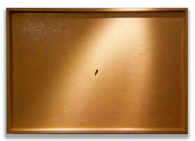
Wolfgang Petsch, as a graphic design student, created a transformative intertwined ready-made subject that pays homage to Duchamp's most notorious piece. This parallel approach showcases their artistic claim of having a clear vision and distinct signature.
The humble mouse trap, a simple and functional device designed to catch rodents, is not something that one would typically associate with art or key insights - nor with a female body. This is exactly what happened with the mouse trap. Thanks to a creative genius step into the air, it underwent a metamorphosis and became a symbol of feminine abstract icons and innate beauty. This is art exemplifying the power of artistic interpretation and re-contextualisation. It can be a highly subjective and personal experience, allowing for diverse interpretations and connections with the artwork. Artists can take everyday objects, subjects, concepts, or performances and give them new meaning through their creative expression. In this case, the artist has taken the mouse trap and re-imagined it as a representation of feminine tangible abstract and beauty, highlighting and illuminating the transformative nature of art. This demonstrates how art can challenge our perceptions and invite us to see women in new and unexpected ways. |

|
Simone Pick
|
In her work Simone deals with the topic of incisions and their effects - from her point of view a deeply human topic, individually but also socially.
What are the effects of incisions? What associations do they create in her works? Injury or opening, compression or free space, solidification or movement, change and further development? The basis of the sculptures is always a supposedly "simple" form, such as plates and blocks. These are then opened up into complexity through incisions and, in some cases, subsequent transformation. They reveal a new form that already lies within them. Depending on the material and its possibilities for taking up and implementing the theme, a range of sculptures and sculptures emerges that develop a strong change of form to works in which the focus is entirely on the cut. She currently works with bronze, steel, clay, paper and wood. |

|
Karine Prette
|
Karine Prette continues her quest for the intimate and mysterious creation of being. She uses two opposing and complementary pictorial techniques, the figurative and the abstract.
Through work on material and its density, she invites artists who touch her deeply to take form. Penetrating, tormented or serene, yet marked by life and passion, each of them scrutinises the viewer, calls out to them, and questions them. In relation, the abstract then becomes the reflection of her own emotions, those felt in front of the artist's work and the intensity and turmoil that their art has left her feeling. As if they were on a life path, colours glide on linen. Through layers, scraping, glazes, traces assert themselves and scars remain. Beyond the deceptive surface, the essence is revealed and, finally, it discloses hidden infinity. The bright day gives way to the darkness of the night. The painted material invades the canvas and vibrates, reaching the mind as well as the heart of the beholder. In this intense work, a profound connection with the canvas establishes a dialogue. Figuration and abstraction: these expressions confront and support each other, according to our interpretation. |

|
Olya Ranguelova
|
Olya Ranguelova is a French painter and pastellist, native of Bulgaria. After having lived in the capitals of numerous countries in her childhood and adult life, she found her homeland in the North of France, on the Opal coast.
She is inspired by the vast open spaces and the close intertwining of farmland and seascape, under the soft light of the French Northern coast. Her artworks depict the impact this peculiar scenery has on people and how they interact in this unusual environment. One of her recurrent themes is also the portrayal of the peacefulness that emerges from human relationships, between a mother and a child, close friends or mere walkers enjoying the natural sites. The result of her pastel artwork and paintings are intimate family scenes that take place in large open landscapes. Even if the scenes depict individuals portrayed from a distance, Olya Ranguelova is sharing moments that these anonymous people may cherish with the viewer of the artwork. Other artworks mostly focus on transcribing the Opal coast’s nature and landscapes and the painter's relation with them. |

|
Henny Salimans
|
Henny Salimans draws with chalk in a painting-like way to depict horses on canvas. She combines expressive lines with surfaces in a subtle range of colours.
On three, four, five or more panels, the theme ‘Horses’ has been abstracted. On these so called polyptychs, horsebacks roll over the panels in endless repetition, like the never -ending motion of waves. |

|
Saloua Sarhiri
|
One travels through her paintings, where colours and shapes feed the imagination.
Saloua is passionate about the flexibility of this form of visual communication. Her art is textured and coloured surfaces, expressive and fine works at the same time. Her brushes dance to music and the atmosphere in her studio. Music guides her movements and her imagination dictates the colours. She likes playing with the contrast between matte and glossy as well as with the transparency of colours. As a child, Saloua spent a lot of time in her mother’s studio, a painter by passion. Welcome to her happy world. |

|
Lia Scheipers
|
Lia Scheipers has always created things; her art education in Antwerp was not the beginning. Long before her secondary school career, her parents were invariably told that she was a high-flyer in one thing and that was creative subjects, drawing especially. For her creative father - who also drew himself - there was only one logical step: to pursue art education. She was 11 when she first took the bus to Antwerp to develop her talents.
On canvas, she provokes, mainly by using a lot of black, sometimes adding a small colourful touch. She can also surprise right away with a monochrome in colour. She uses tight lines but also produces soft and flowing movements through the medium, especially acrylic and ink. The many layers and their transparency do not necessarily hide the linen’s texture. |

|
Ivan Sizonenko
|
How to render music pictorial or painting musical?
A music of rhythms and notes, a painting of shapes and colours. The golden ratio is part of what human beings experience as "being in proportion", as it is naturally inscribed in their environment, geometric harmony, balance of the internal forces of living beings. In this way, serial paintings are the result of pictorial, geometric and arithmetical rules, based on the golden ratio, and colour combinations or permutations based on the Fibonacci sequence. They come under the heading of concrete art, Konstructiv Kunst. Ivan Sizonenko has been painting since September 1994, driven by the need to represent balance, harmony and rhythm, under the influence of synaesthetic images that appear to him when listening to music. Born in Paris on September 23, 1960, he has lived in Geneva since December 1969. He graduated from the Swiss Federal Institute of Technology in Lausanne in 1983 with a degree in engineering-physics, and from the University of Geneva in 1993 with a degree in science history and philosophy. |

|
Ralph Spegelaere
|
Ralph S.: "Painting as soon as I wake up at night is a bit like chasing my dreams. Brushes in hand, I'm in a state of continuous mediation."
Ralph S. mainly works in oils. He paints every night, between waking and sleeping; this is a way of letting go and letting his emotions express themselves fully on canvas. The evolution of the world, society, the feminine condition ... The painter always combines painting and philosophy, accompanying the viewer on the path of a reflection as free as it is intimate and profound. Ralph S. insists on this freedom, this absence of judgment, this pure and generous invitation to reflect and feel. He has won several awards in Italy, most recently the MEDUSA prize in Lecce, and over the last three years has produced more than 200 canvases. His colours are vivid and pure; his strokes poetic. These works are always to be found somewhere between reality and fiction, between figuration and abstraction. |

|
Sofia Speybrouck
|
Her work is a search for the beauty that can be found all around us. It is a search in which Sofia is guided by her feelings, surroundings and nature. She uses this inspiration to depict the subject in its purest essence and full strength, using abstract forms and lines. Each piece is a play with the balance between positive and negative space. It is a thoughtful and strongly personal style with which she translates a wide variety of subjects into ceramics, bronze and canvas.
Sofia Speybrouck (°1970) studied Fine Arts with a specialisation in Ceramics at the Hogeschool Sint-Maria Instituut (Antwerp) and at the Provinciaal Hoger Instituut voor Kunstonderwijs (Hasselt). Her studio can be visited throughout the year by appointment. |

|
Marlène Stevers
|
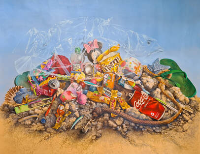
For Marlène Stevers, painting is a process in which she can totally forget herself and can be purely concerned with creating the painting. Through this method of working, the painting retains the energy with which it was created, passion plus conviction.
A passionate and skilled artist, Marlène has devoted herself to ancient painting techniques. So, she uses this complex and time-consuming way of painting in her contemporary theme, "plastic waste". A saying of hers is: "Art is to depict current themes in a graceful manner". |

|
Mieke Tambuyzer
|
After years of painting with acrylic and Indian ink, Mieke began drawing with a 3D pen eight years ago.
This medium allows her to work both two- and three-dimensionally. The vibrations, fine lines and layering give her work the poetic expression she strives for. Her works are both abstract and figurative. The safe nest that is so important for everyone keeps her busy. Connectedness versus indifference is her key concept. |

|
Eva Timmermans
|
Eva Timmermans, a talented artist, has distinguished herself in recent years by her unique contribution to the world of abstract art. In an artistic context where creativity and expression are central, Eva manages to create an impressive synergy of form, colour and emotion with her works.
Abstract art, as a movement, offers artists like Eva Timmermans the freedom to step outside the traditional boundaries of realism. Eva's creations reflect a fundamental exploration of her inner world, often using non-figurative elements to capture her emotional experiences and thoughts. |

|
Geneviève Toye
|
Born in Mouscron in 1965, she grew up in Boechout near Antwerp, seemingly fertile ground for artists. She reaped further fruits of artistic inspiration at the academy in Borsbeek, Lier and then the Henry Van de Velde Institute, also called "the academy of Antwerp" later on. After that, pencils, drawing board and brushes were traded in for 25 years of diligent work in the financial and consulting world, alongside a busy schedule as a young and not-so-young mother, helping to guide four children into adulthood.
As they gradually discovered their own path, both school and the easel beckoned. School took precedence: Geneviève graduated as a socio-economic anthropologist in 2011. After that, it was time to bring out the brushes, as the other boxes had been ticked off. In 2013, she timidly started painting again. It brought peace in what was a difficult period, a time of illness and financial worries. The brushes became her escape route, bringing her a breathing space in the last 10 tough years of permanent pain and other hardships. Her flowers have an anointing effect. The abstract works are an expression of the colour of the moment. "I wish you a sunny, fascinating journey alongside my story; here are my chunks of hope and small windows onto joy and a peaceful life.” |

|
Bernadette van Baarsen
|
Bernadette van Baarsen was born and raised in Amsterdam. From an early age she made objects, first in wood that she found at the beach, later in Plexiglas. After an eventful life as a punk singer and then an academic, she returned to the artistic path and started painting. In Provence, Bernadette discovered the power of form and colour. She became animated by a landscape in which both raw nature and man-made geometries contrast with and enhance each other. Each painting is a search for the unknown balance in which a multitude of colours and the overwhelming sun are inevitable truths.
|

|
Mieke Van Cauter
|
Mieke Van Cauter is a mixed media artist, working with different materials and textures. One moment as a storyteller from her own experience or inspired by what is happening in the world. The other moment it is a game with colours and she seeks abstraction. She uses acrylics, charcoal and oil pens.
She took courses at the Kara Bullock Art School, Olga Furman Art School as well as with Patti Mollica, Julie Schumer and Robert Kelley, among others. In 2016, her enthusiastic freedom to paint received a firm dent due to a medical accident. This left her unable to do anything with her right hand and arm overnight. However, she did not sit back and she began her rehabilitation a few months later. The ultimate goal of her rehabilitation programme was: "To be able to live independently again as well as draw and paint." Thanks to a lot of perseverance and a specific programme of daily exercises, she was able to achieve this goal. Painting and drawing changed. The stiffness in her hand gradually disappeared, making daily painting at certain times a virtue and at the same time a necessity. Besides, it also turned out to be the ideal distraction for the pain. The past few years did not follow an easy course but, at the same time, they bestowed on her a form of wealth. On this, she says: "Painting became my greatest tool and makes me happy. I like to inspire people." |

|
Rony Van den Block
|
Rony Van den Block (°Meise 1963) moved to Antwerp after his studies at the Sint-Lukasinstituut in Brussels. He built up a fine career as an independent graphic designer and continued to draw and paint passionately. Through a series of coincidences, his family name became his trademark. With his blocks, he imposes an almost absurd restriction on himself in order to address the theme of liberation.
Even though he only came out with his artworks later, the exhibitions under the name [unblocked] are progressing very fast. His work explores the boundaries between abstract and figurative. In addition to the blocks, the purity of colour, matter and the touch of humor are very typical. His work is multi-layered according to the distance of observation. A refreshingly new artist with the skills of an old master. |

|
Dennis Van den Bossche
|
The diverse oeuvre of Dennis Van den Bossche includes both paintings, bronzes and graphics in which the universal prevails over the anecdotal.
The paintings are made using both modern and old techniques (glazing). The bronze sculptures are mostly made according to the lost wax technique whereby each sculpture is unique. |

|
Tosca Van den Braak
|
As an autonomous artist, Tosca is always looking for new ways to shape her ideas. She enjoys working with different materials and is constantly exploring their possibilities. Every concept Tosca comes up with requires specific materials and techniques. Also, the properties of a material lead to new ideas and discoveries, which in turn enrich her creative process.
In her artworks, you will find a constant thread: order in chaos. Tosca is fascinated by the ambivalence of life and the way people interact with the world, each other and themselves. Her work reflects her personal view on these topics. She tries to understand and visualise the complexity of the world around us, and she invites viewers to look at their own actions and surroundings with fresh eyes. Tosca hopes her work contributes to a deeper reflection on our place in the world and our ability to bring about positive change. |

|
Danny Van der Elst
|
Danny Van der Elst showcases an ability to create striking portraits that are both deeply personal and universally resonant.
His images are a poignant exploration of identity, form and the myriad ways light can reveal the depths of our humanity. Danny Van der Elst’s work has been exhibited internationally (including FIABCN Barcelona, ART MUC Müchen, fotofever Brussels, CONTEXT Art Miami, photo festival Knokke,...). With his project Pure Photo Sessions, he offers his talent to private clients looking for unique images of themselves. |

|
Carie van der Kloot
|
Carie van der Kloot is an artist from Wortel. She has been working with natural products for more than 20 years. Nature is her source of inspiration. She draws natural living into her daily life and draws a little closer to nature as a result. She went so far in doing this that she now stands next to nature. Little did she know that you can get that far. She does not paint to show what she can do but she paints to discover. She has written several books on how natural living makes you look at life from a different angle/perspective.
|

|
Kaat Van der Marliere
|
Kaat Van der Marliere
Visual artist ( °Bruges 1956) works with acrylic and ink on linen, making abstracts with signs and text. She addresses "le mal du siècle" with a certain irony, poetry and absurdism. |

|
Jacqueline van der Plaat
|
Jacqueline van der Plaat was born in Amsterdam in 1959.
After studying at the Gerrit Rietveld Academy, she developed her own style over the years. With the female body as the main subject for her paintings, she tries to portray the power of women in a gentle way. Her works usually start with a mix of acrylic paint and collage of textile and paper, from which female figures gradually emerge. This way of working creates an interesting and varied image to look at. Sometimes she makes a foray into flowers or animals, which she also depicts in a colourful and decorative way. |

|
Roman Van Gelder
|
In his work, Roman is inspired by the beauty of nature, animals, flowers, landscapes and light changing throughout the day. The seemingly random way of how flower petals fold around each other. How sun rays burst through a thick layer of clouds after a long rainy day. The endlessly different colour tones that appear during a beautiful sunset. An early spring morning, mist covering the landscape as a thick blanket, making houses and trees barely visible due to the dense atmosphere. Or a blackbird singing on a branch in the garden. Roman's connection with nature is his life force and makes him happy. He creates everlasting memories in paint to make the viewer aware of how beautiful and precious our world is.
|

|
Haggith van Hees
|
Haggith’s work is distinguished by her ability to integrate emotional depth and story into her paintings. Her palette is infused with vibrant colours that evoke emotions and moods, and the compositions often tell a story that invites the viewer to introspection. Through her art, she tries to make a connection between the viewer and the essence of her own experiences and feelings.
Haggith’s paintings are not only visual masterpieces, but also a reflection of her deep involvement with the world around her. She continues to evolve as an artist, constantly looking for new sources of inspiration and challenges to push her creative boundaries. Haggith’s journey, which started as a child admiring art, has grown into an impressive artistic journey that stimulates the senses and fuels the imagination. |

|
Rudie van Holderbeke
|
Rudie Van Holderbeke (°1953 Belgium) is a part-time student in the DKO first specialisation year in painting at the Royal Academy of Fine Arts Antwerp, under the guidance of two young internationally active painters: Nils Verkaeren and Pieter Jennes.
His oil paintings are about people in motion and their body language, not surprising when you know that his entire professional career was dominated by physical training and sports. For his personal style, he draws his inspiration from the work of contemporary painters like Mark Tennant, Alex Kanevsky, Edwige Fouvry and Peter Doig, as well as colourists like Matisse, Munch and Gauguin. Although still in training, he has already been able to show his work in two exhibitions: September 2023, selected for the 'Nalatenschap Bart D'Eyckermans' at the Royal Academy of Fine Arts Antwerp. In December 2023, he held his first solo exhibition at the CULT gallery in Antwerp. |

|
Vanessa Van Meerhaeghe
|
Vanessa Van Meerhaeghe's artistic journey is rooted in her background in fashion design, which has had a profound influence on her approach to painting and illustration. While elements from fashion - such as coloured patterns and detailed clothing - add depth and story to her work, it is mainly the characters that tell the stories within her paintings.
In addition, her artistic quest extends to the exploration of nature. Nature serves as her muse, providing rich backgrounds and settings that complement the narratives of her characters. On hikes and trips, she immerses herself in the beauty of nature, stylising its forms into her paintings or transforming them into graphic elements. |

|
Benedicte Vandewattyne
|
Benedicte is an authentic Belgian artist with a strong temperament that gives her works a sincere, enchanting, brilliant and delicate soul (A.I.C.A Hugo Brutin). In her painting, she seeks a balance between abstract and realism to convey different realities to the viewer. Everyone has their own interpretation. Her works are characterised by the use of an expressive and high-contrast colour palette which, combined with geometric shapes, gives the painting cubist effects. Notable here is the frequent use of the triangle. This distorts reality by its pronounced contrast with the context of the work. Just like a puzzle when a piece is taken away, she pushes the 'STOP' button and wants to freeze and capture a certain special moment in life. Her technique mixes marker and oil on canvas which gives structure and strength to her works.
She is a perfectionist, never satisfied, constantly pushing her limits and cannot resist expanding them. This gives her the strength to keep surpassing herself, never dwelling on one theme and always looking for new horizons and new energy. Benedicte has been painting since early childhood. For her, it is the most natural way to express herself, to escape. She studies at the Academy of Fine Arts and graduates from the Saint Lucas Institute in Tournai. |

|
Tom Vanhauwaert
|
The Belgian artist Tom Vanhauwaert has been attracted to art since childhood, gaining his first recognition in 2015. Before that, he worked as a carpenter.
Through his minimalist language, Tom grants us a subjective view of life, of existence and the depth of characterisation in the human being. This depth is complex and finds a representation rationalised, articulate, orderly but lively with bright and strong colours, redolent of pop art. The purpose of these works is to “spread the message”, to share emotions, to participate in life, the life that Tom Vanhauwaert defines as a high-speed train, a journey rich with experiences. The will to use the minimalist language to express life’s complexity springs from his intention to display the beauty and the joy that can be found in life through the simple and humble things that abound in it, but which usually go unnoticed. |

|
Saskia Verguts
|
Saskia Verguts took courses at St. Lucas Gent, PXL Hasselt Somato-psychopedagogy and later model and drawing art at the Art Academy in Geel. Her work mainly consists of the well-known 'Humbolds®', which have been registered in Europe since 2020.
Humbolds are brave gentle spirits always with infinite understanding for each other; the name derives from 'humble', with a touch of 'bold' (sprightly enthusiasm). They are made from water and sand, charcoal and fire. Humbolds here are in a serene enclosed group, surrounded by raised cement textured sections in a pearly haze. The work previously hung at the Halle in Geel and the Royal Museum of Fine Arts in Antwerp. (KMSKA) |

|
Gregory Verheecke
|
Gregory Verheecke captures the energy of the world. Often working with bright colours, lines and textures, he strips down his mental process to attain a pure state of creation with no interference of thoughts. Trying to navigate between this process of 'thinking-not-thinking', the same figuratives appear unconsciously, often animals, flowers and trees ... This pure state of innocence is not easy to attain and has a relationship with meditation techniques, where mental processes are stripped off, layer by layer, to attain a higher state of consciousness. He is looking for his inner child to express himself, as children's drawings often come straight from the heart. His colourful compositions are an ode to the joy of the present moment, a grateful reminder of life itself.
|

|
Claudia Vialaret
|
Claudia Vialaret usually draws her inspiration from art history and literature. She takes photographs (live models, landscapes, etc.) that she prints and then transforms to distance them from banal reality. She handles photo paper by crumpling it, folding it, tearing it and then she explores all its alternative visual possibilities to breathe new life into the images. The paper, with its folds, its hollows and its volumes, reveals hidden dimensions and transforms the original image. Finally, she creates a final composition on the computer, guided by the original inspiration from art history, as if she were weaving a tapestry. Here, she presents two series: Origins and Times of Troubles.
Origins 2017 -2020 Timeless stories, heroic tales or Greek mythology have built our cultures. Adonis, Ophelia, Daphne populate our collective unconscious, and each of these allegories takes us back to the origins of our dreams. Claudia mixes these allegories with lush nature to evoke these lost times, in our distant origins, when man merged with nature. The time when the tree, the earth and the sky were his only horizons. This is our cultural and natural origin. Times of Trouble 2022-2024 Three years ago, Claudia began to explore a new medium and printed her photographs on silk. Inspired by the disorders of nature and global warming, she put in motion the landscape pictures taken during her travels. The pleating of this fluid and shiny fabric, forming swirls and reflections, made her dream of strange and threatening landscapes. The clouds mingle with the sparkles of the silk, the trees move, the horizontal lines twist with the contortions of the fabric. These landscapes oscillate between reality and fiction, suggesting a troubled future. |

|
Sonja VishnudArt
|
Sonja VishnudArt's story is as particular as her bronze sculptures, which combine introverted intimacy with extroverted, almost baroque exuberance.
Sonja was born in Suriname, lived and worked in the Netherlands, Belgium, Monaco and Switzerland. She has taken part in exhibitions in Monaco, Montreux, Brussels, Breda, Zurich, Venice and Paris. Her concept for the Memorial in Brussels, in honour of the victims of the terrorist attacks in Belgium, was selected for the final round. She is currently working in her studios in Belgium and Switzerland. Sonja: “My work depicts universal feelings, people recognise themselves in it.” People find that her work mirrors their own experiences in her images. That provides insight into their own story. This recognition of the universal gives peace, openness and freedom. Sonja VishnudArt is self-taught, yet she took private lessons for four years from Charles Vergouwen (professor of the St Joost Art Academy in Breda) in his retirement. She learned to work with different materials such as clay, the lost wax, plaster and plasticine. Every step is in her power until the final process, patination! Sonja works from her feelings, easily straying from her drawing or model which can lead to wonderfully surprising results. |

|
Molly Winckelmans
|
Atelier/Gallery Molly's Artmove is the home of Belgian-Zimbabwean artist Molly 'Maureen Phiri' Winckelmans.
Molly started her career 36 years ago in Harare, Zimbabwe where she achieved awards of excellence. She is a nine-time award-winning artist and two of her artworks are in the permanent collection of the National Art Gallery of Zimbabwe in Harare Molly has been a resident of Bornem for a good 25 years, where she founded Molly's Artmove Gallery from her living room 13 years ago. Molly paints women, strong women, mothers. They are always featured in her signature colourful style, very contemporary and above all unique. As a result, she always catches the eye and is the maverick of contemporary Zimbabwean painting. |

|